What I am proud of
Won enterprise RFP
Design demo sealed the client pitch
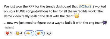
+ 1 New enterprise client
Acquired during the first month after launch
The first client success helped build confidence in the direction of the tool. Positive feedback and adoption contributed to securing an additional enterprise client shortly after launch.
Proposed & shipped a feature
Identified a high-value user need, validated it through research, and delivered it in V1.
Trend comparison wasn't part of the original requirements. I discovered the opportunity through competitive analysis, validated it with strategists who were already doing it manually, and expanded the idea into one of the key workflows.
End-to-end ownership
Discovery → Strategy → V1 Launch → Iteration → V2 Direction
Owned the experience from early discovery through V2 direction. Partnered daily with developers, QA, and strategists to prioritize features and solve user problems, while aligning major decisions with Product Management and stakeholders.
Project Context
A white-label trend intelligence feature for enterprise innovation teams within a Canadian B2B SaaS platform for consumer intelligence and innovation
Problem
Internal users
40% of time spent on manual reporting
Analysts spent too much of their time preparing reports instead of analysing trends.
Clients
Acting on yesterday's opportunities
Insights often arrived after trends had already matured, making it harder to identify emerging opportunities early.
Business Need
Delivery model couldn't scale
Each client required manual report preparation, limiting growth and increasing operational effort.
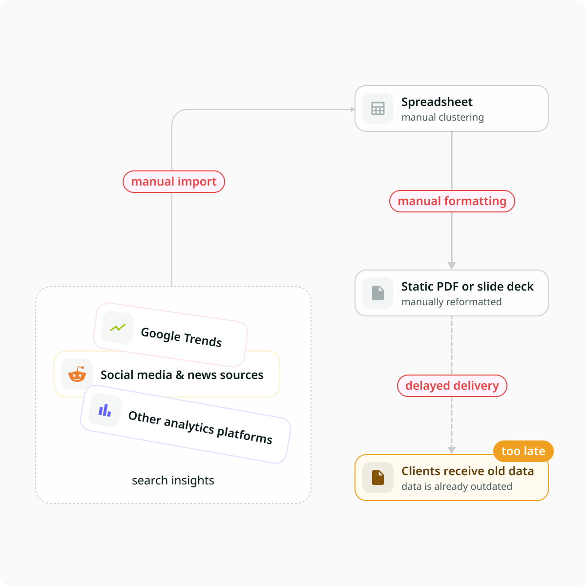
Valuable trend signals were getting lost between discovery and decision-making. Strategists manually assembled insights across multiple tools, while clients received information too late to identify emerging opportunities.
Defining Success
Create a self-service trend discovery tool where users can discover, evaluate, compare, and communicate opportunities without waiting for manual reports.
Discovery and research
There was no clear brief. I received initial requirements and took ownership of defining the product. What it should do, how data should be structured, and what users needed to see.
What is “Trends”? What tools people use for exploring trends? What data they want to get, how and why?
For understanding the domain I simply started to chat with AI and asked questions about trends. Before designing anything, I made competitive analysis and conducted interviews with strategists to understand how trend research worked today, what users struggled with, and what would make the product valuable.
Research methods
- Competitive analysis
- Discovery and Usability interviews with strategists (a tool users, that communicate with external clients)
- Concept testing using low-fidelity flows
Competitive Analysis: Key Finding
I explored trend intelligence tools including Trendtracker, Exploding Topics, Trendwatching, Treendly, Google Trends, and Glimpse. While these platforms were effective at surfacing trends, they placed most of the analytical work on the user, requiring them to interpret data, compare opportunities, and build recommendations themselves.
During the review, one workflow stood out: side-by-side trend comparison. Google Trends and Glimpse treated comparison as a feature, but I saw an opportunity to evolve it into a core decision-making workflow. This hypothesis was later validated with strategists and became part of the V1 scope.
Trends Comparison: from an insight to core flow
What I discovered
Comparison existed as a feature in competitor tools. After understanding the domain, I recognized it could become a core workflow rather than a standalone capability.
What I validated
Strategists confirmed they were already comparing opportunities manually in spreadsheets when working on trends reports.
Results
I took the initial idea and transformed it into a broader workflow. It became one of the key workflows delivered in V1.
About ComparisonValidating the information architecture
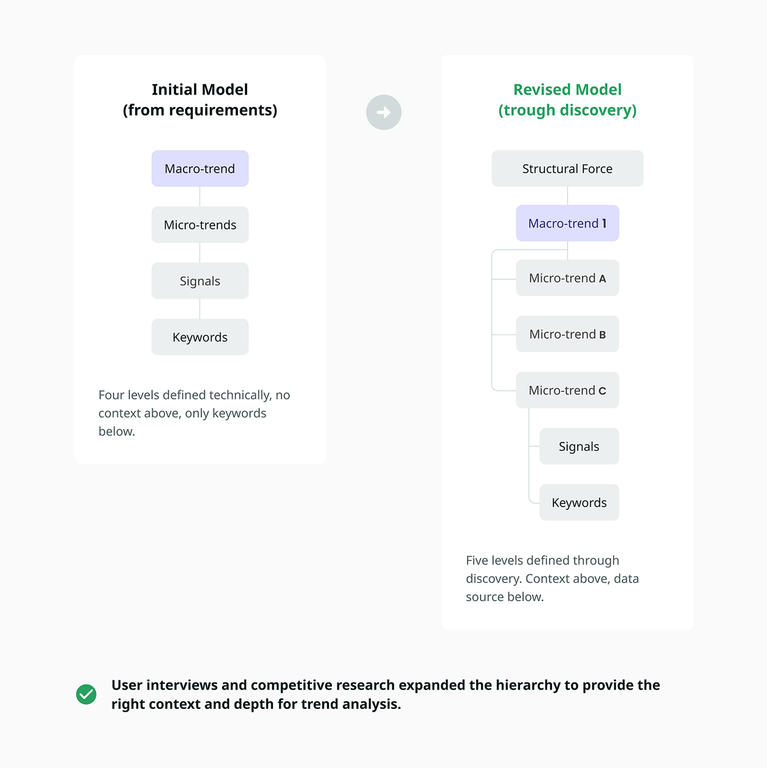
Before designing any screens, I drafted an initial hierarchy based on requirements and competitive research.
I used this structure during interviews to understand how strategists organised trends and where they expected context to live.
User feedback expanded the original 4-level model into a five-level hierarchy.
User Interview Insights
I conducted discovery interviews with research strategists — the primary users of the tool. Since they also represented client needs, their feedback helped shape both the information architecture and the complexity of the experience.
In addition to interviews, I validated early concepts through low-fidelity flows and visualization workshops to understand how users evaluate and communicate trends.
Key Findings
Workflow
“My system is really a patchwork.”
Strategists switched between multiple tools and spent significant time assembling reports manually.
Insight
Users needed one place to discover, evaluate, compare, and communicate trends.
Hierarchy
“I need to understand how trends are connected.”
Users wanted to understand relationships between signals, micro-trends, and macro-trends rather than seeing isolated entities.
Insight
Relationships needed to be visible across multiple levels.
Hierarchy
“Structural forces matter, but they are not what I use every day.”
Users wanted to see the big picture, but spent most of their time evaluating individual trends.
Insight
Context should be helpful, but not take attention away from the trends themselves.
Comparison
“We compare trends today, but in a spreadsheet.”
Strategists were already comparing trends manually to support recommendations.
Insight
Comparison should be a workflow rather than a standalone feature.
Metrics
“I need to know what stage a trend is in and what is driving it.”
Users cared less about complex charts and more about understanding momentum and supporting signals.
Insight
Key metrics and drivers should remain visible throughout the experience.
Discovery and filtering
“Finding the right trend is as important as understanding it.”
Users needed ways to narrow large sets of trends based on industries, categories, regions, and channels.
Insight
Flexible filtering became a core part of exploration.
Differentiation
“I don’t want every macro-trend to feel the same.”
When reviewing early concepts, users emphasized the importance of quickly recognizing themes and distinguishing one macro-trend from another.
Insight
Visual cues should support recognition and reduce reliance on reading.
Monitoring
“Some trends are worth keeping an eye on.”
Users wanted to revisit opportunities and track their evolution.
Insight
The experience should support continuous monitoring, not just one-time discovery.
Final solution
Research shaped the product. Here are the core screens from the first release.
Dashboard
-
Three levels in one place
Structural Forces, Macro, Micro and flexible layout, so users can change of order of these sections.
-
Filters always within reach
Fixed filters help users quickly narrow trends by region, category, channel, and timeframe.
-
Spotlighted trends
Teams can curate trends worth watching and keep important opportunities visible.
-
Visual differences of the trends
Each level had its own visual style, making the dashboard easier to navigate.
-
Relationships stay visible
See how Macro- and Micro-trends connect without opening details.
-
Evaluate before clicking
Growth, sparklines, and summaries help users decide faster.

Trends cards
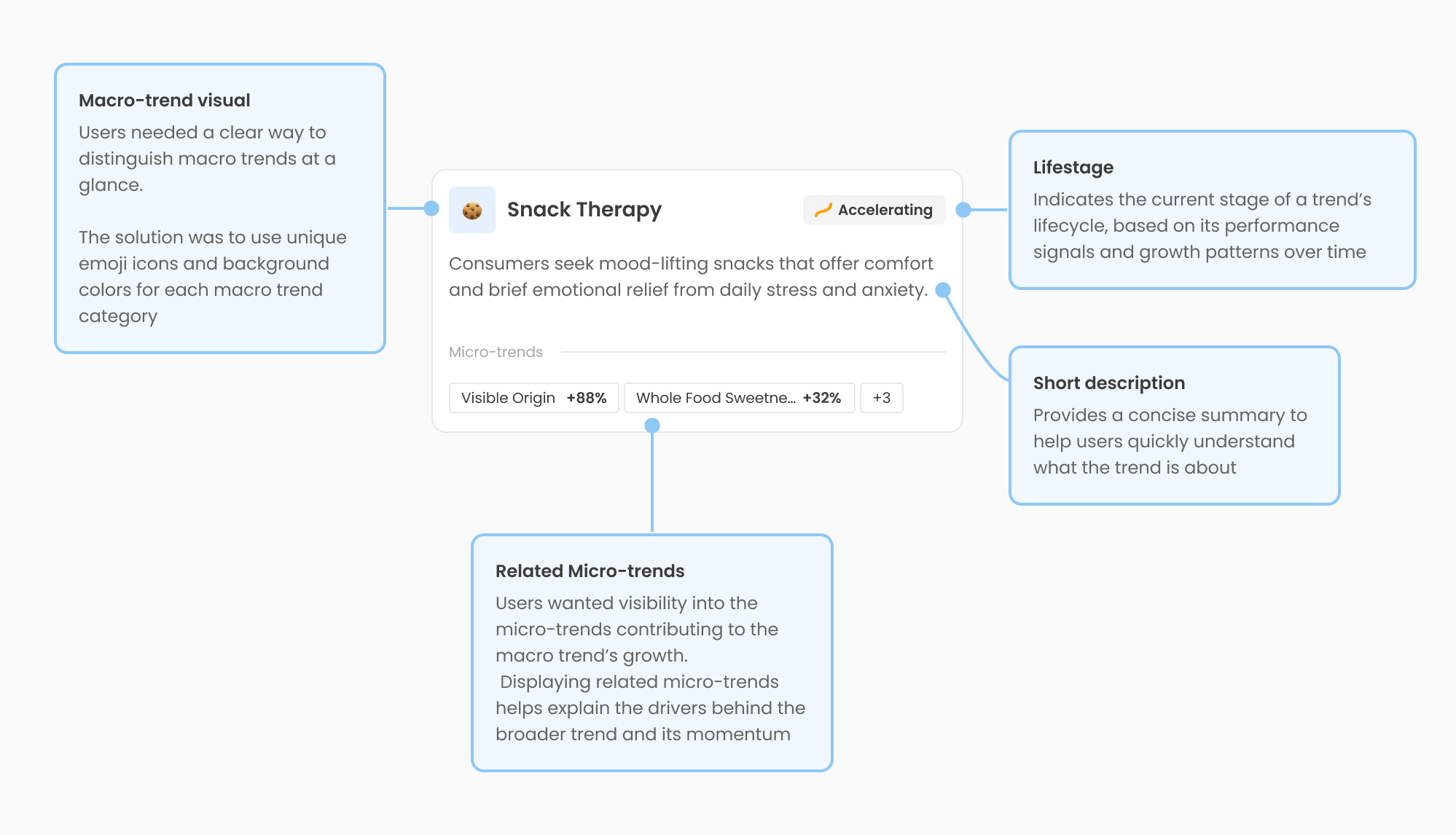
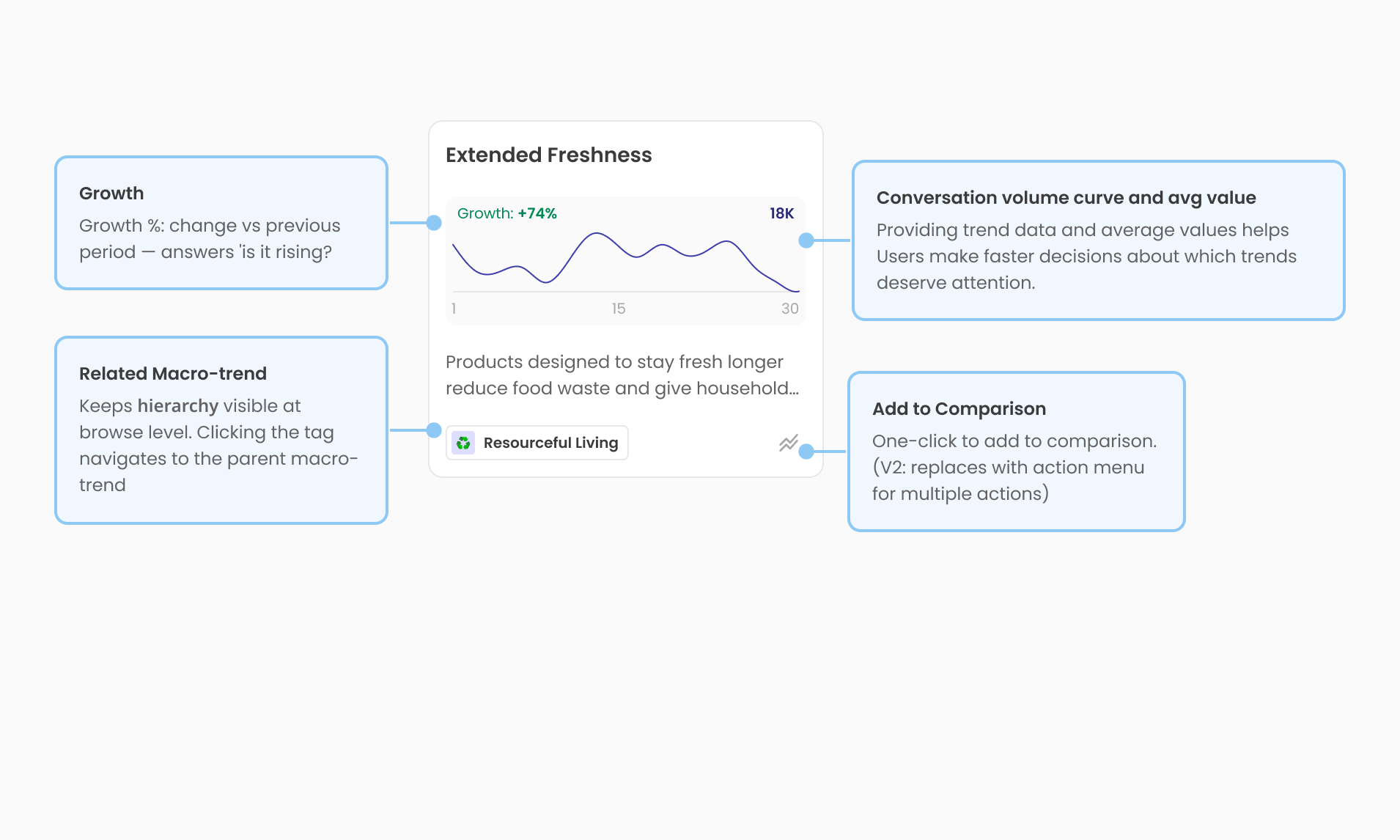
The most repeated element in the product. Had to answer six user questions without a single click. Is this real? Is it growing? Is it big enough? What does it mean? Where does it fit? Can I compare it?
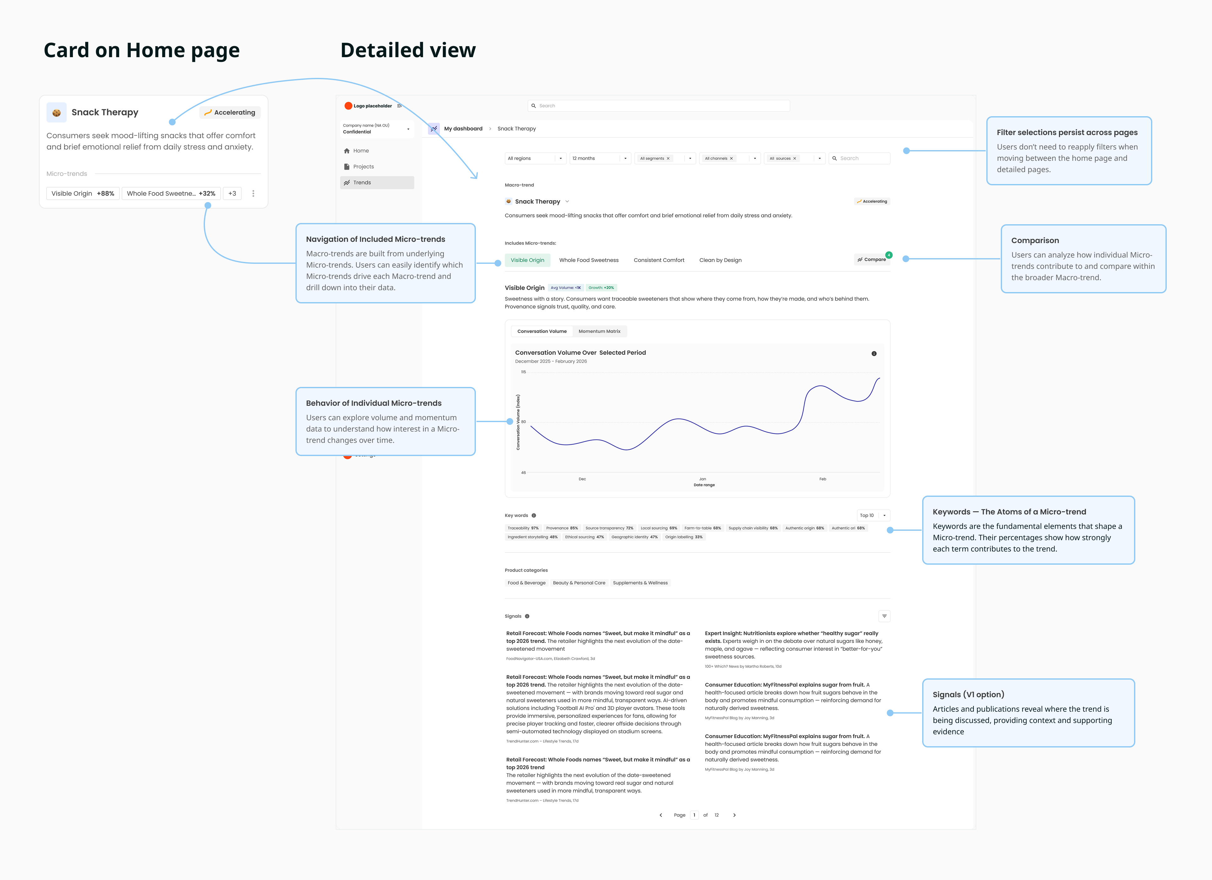
Trend Details
The reading order mirrors how a strategist thinks. Charts above the fold, signals below. Clarity over completeness.
Comparison
During competitive analysis, I noticed that tools like Google Trends and Glimpse supported side-by-side comparison. User interviews later confirmed that strategists were already comparing opportunities manually in spreadsheets. I proposed expanding this into a core workflow and it became part of the V1 scope.
Users no longer needed to copy charts into spreadsheets to evaluate opportunities.
Compare opportunities
See several trends in one view instead of assembling spreadsheets.
Separate long-term opportunities from short-lived
Understand whether growth is steady or driven by one-off events.
Build stronger recommendations
Use charts and evidence to explain why one opportunity matters more.
Prioritize with confidence
Identify quick wins, early bets, mature markets, and declining trends using the Momentum Matrix.





Post-launch iteration
Structural Forces lacked depth
In V1, Structural Forces were introduced as high-level context cards. After launch, users asked for more information, so I conducted another round of interviews to understand what was missing.
Users wanted
- Growth over time.
- What changed during the selected period.
- Keywords and signals driving each force.
Based on these insights, I expanded Structural Forces from simple cards into dedicated detail pages.
V1
- High-level context cards.
- Limited information.
- No visibility into drivers.
Post Launch
- Dedicated detail page.
- Growth and key metrics.
- Keywords and supporting signals.
- Richer explanations and evidence
Trends Map
After launch, users wanted a way to understand the entire trend landscape rather than exploring trends one by one.
Follow-up interviews showed they needed to:
- Compare trends in one view.
- Understand lifecycle and momentum.
- See relationships between Macro- and Micro-trends.
- Identify growing and declining opportunities.
These insights led to the Trends Map.
Signals
Signals were one of the most trusted parts of the experience. While strategists were comfortable with the V1 view, enterprise clients wanted more detailed information and clearer explanations.
Client feedback highlighted the need to:
- Understand why a signal mattered.
- See richer context around articles and reports.
- Distinguish key evidence from supporting information.
- Scan large lists more efficiently.
These insights led to improvements in signal hierarchy, readability, and supporting context.
V1
- Expert-oriented view.
- Dense list of articles.
- Limited context.
Post Launch
- Richer evidence cards.
- Clear hierarchy and summaries.
- Easier to understand and share insights.
V1 → V2 Evolution
Comparison by Region
Users wanted to understand not only what was growing, but also where it was happening.
This led to Volume by Region, first introduced for individual Micro-trends and later extended to the comparison workflow.
It helped users:
- Identify strong markets.
- Distinguish global trends from local ones.
- Compare regions side by side.
- Tailor recommendations to different clients.
Volume by Region for a Micro-trend
See where a trend is gaining traction

Regional comparison across trends
Compare how multiple trends perform across markets

“So what”
Users needed more than numbers — they needed to understand why a trend mattered and what to do with it.
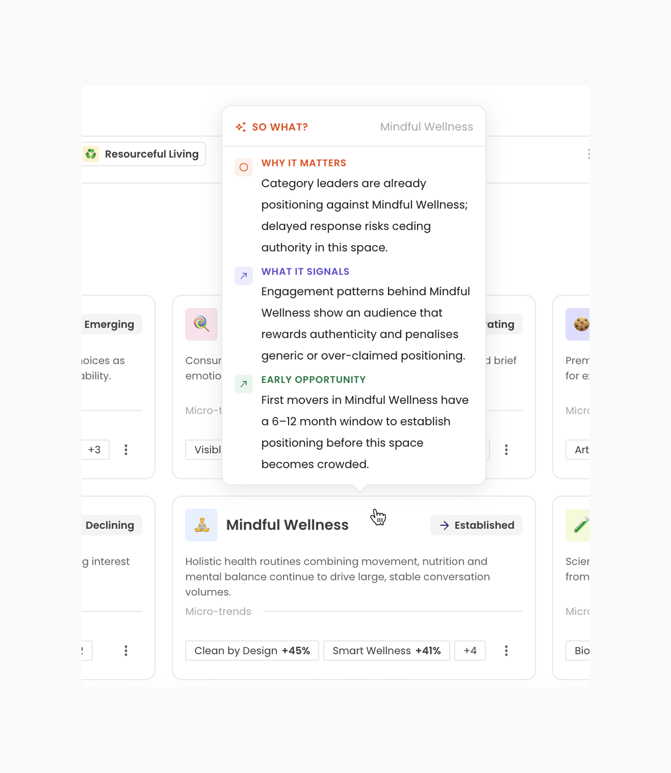
To bridge the gap between insight and action, I suggested “So What?”, an AI-powered layer that adds context directly to trends and charts.
It helped users:
- Understand why a trend matters.
- Connect signals to broader market shifts.
- Spot potential opportunities.
- Explain insights to stakeholders.
How it works:
Hovering or clicking on a trend reveals AI-generated explanations:
- Why it matters
- What it signals
- Early opportunities